by: Jeffrey Staso

As we roll into 2021 there is a lot that’s new in web design. This past year has been full of challenges for everyone and meeting those new challenges with new ideas is key. People are expecting more from the web. As web design students your job is to understand and craft solutions that can grow with changing times. How can you deliver content in new interesting ways that is still easy for users to understand?
Here are a few items that are becoming popular on websites as we roll into 2021.
Using Color for Web Design in 2021

Photo by Sten Ritterfeld on Unsplash
Color is a major factor of defining a brand. Like typography, color helps set the mood, establish personality, and direct attention. For web design in 2021 we are seeing the following trends in the area of color
Gradient Color Schemes
Gradients are a transition between two or more different colors to create a blending effect. They can be bold or subtle and add depth and interest to a design without pulling a lot of focus. Gradients began to come into the mainstream in 2018 when Instagram changed their logo to include a gradient. Gradients are easy enough to add to a background on a website. Putting a lighter color near the top and a darker near the bottom creates a vertical depth.
Further Reading
Dark Mode
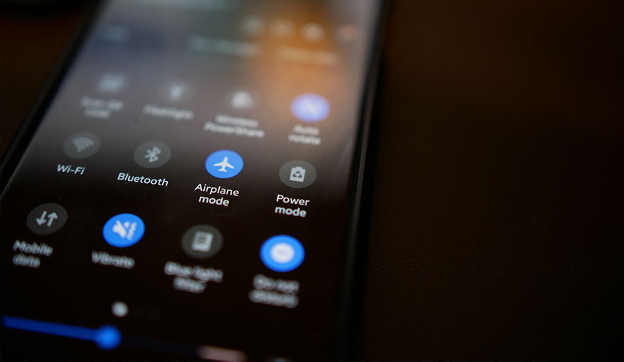
Not everyone experiences the web the same way. We must make sure that sites are usable by visitors with disabilities and by those using adaptive software. In addition to usability concerns, users are demanding more choices than ever in how they want to view your site. Implementing a choice between “Light Mode” and “Dark Mode” is a good start.
Using a dark mode theme on your website can cut down on blue light. Humans are biologically affected by light, but not all light is created equal. Blue light, such as sunlight, helps us stay alert. Computer screens emit blue light. This is great during waking hours but exposure to blue light before sleeping can be detrimental. Blue light suppresses the secretion of melatonin which is needed for sleep.
Dark Mode also saves battery on mobile devices. Mobile Enerlytics discovered that at full brigthness dark mode reduced power draw by up to 58.5% on popular Android aps. Mashable reports a 33% increase in battery life on an iPhone 11 Pro Max using dark mode.
Implementing Dark Mode
Designing a dark mode theme doesn’t mean just putting it on a black background. Consider avoiding pure black and going with something in a deep gray such as #121212. Remember as well that colors will look different on a dark background than they will on a light background so don’t be afraid to change your color scheme in dark mode. Use extra whitespace when designing in dark mode as the eye will have a harder time telling elements apart.
Further Reading
- Blue Light Has a Dark Side – Harvard Medical School
- 8 Tips for Dark Theme Design by UXPlanet
- Dark UIs. The Good and the Bad. Dos and Don’ts by Miklos Philips
- 25 Dark and Amazing Websites – Vandelay Design
Typography for 2021

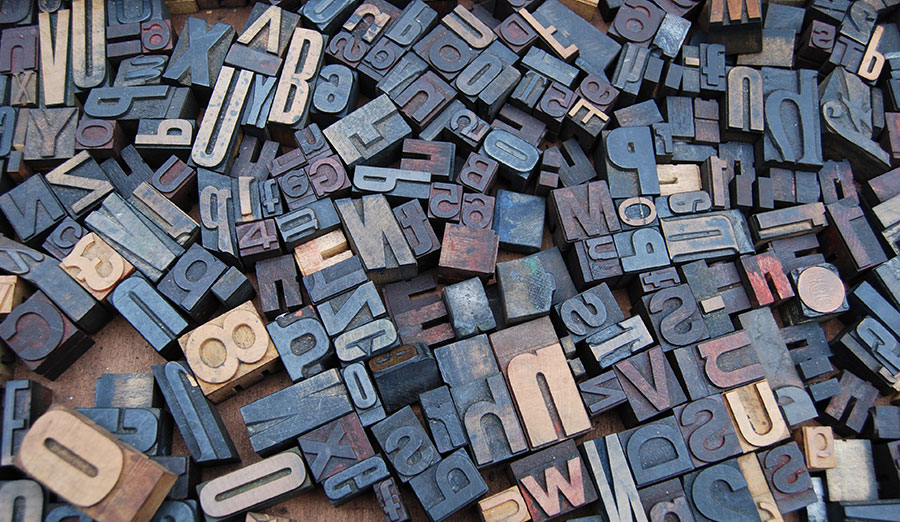
Back in the dark ages of web design we were stuck with only a handful of web safe fonts. These fonts were included with most operating systems and could be safety used on a website without worry. Today, a designer has the ability to include any font they wish on a website.
System Fonts
Every device has a font face that it uses for menus, names, icons, etc. This is called the system font. This font is optimized for that particular device. Using system fonts on a website is not new, but it is a great way to ensure that your font is legible on the user’s device. Consider implementing it for articles, blog posts, guides, and other long amounts of text.
Implementing System Fonts
Implementing system fonts is as easy as setting your body selector as a string of font names just as you normally would. If the system includes that font it will render text with it, if not the device will try the next font in line. It’s a good idea to stick a web safe font such as Arial at the end of your font stack.
body{
  font-family: -apple-system, BlinkMacSystemFont, avenir next, avenir,
  helvetica neue, helvetica, Ubuntu, roboto, noto, segoe ui, arial, sans-serif;
}
You can find an updated list of sans-serif, serif, and mono system font stacks at https://systemfontstack.com
Experimental Fonts
Fonts have a double job of expressing information through letters but also expressing information through design. Fonts can give a lot of personality to a web page. The science of choosing fonts is out of the scope for this post but different fonts can express different moods, personalities, thoughts, feelings, and intentions. Using unusual fonts can help bring life to a page that might otherwise be boring. Read about 8 fabulous font trends for 2021 in this article by 99designs. How could you implement this in your own work?
Like fashion, architecture, and fine art, fonts that were trendy five years ago are boring today. In addition, fonts that may have been popular thirty years ago are making a comeback. If your product depends on being on the cutting edge of trends, you’ll want to pay close attention to the fonts your competitors are using. Check out this article on What Fonts are Trending Now and Font Trends for 2021 by Evnato.
Design Schemes for Web Design in 2021
Skeuomorphism
In the 2000s there was a trend toward making interfaces look like real world objects. This design trend is called skeuomorphism. The idea was that users would better know how to use an interface that mimicked a device they already knew how to use. In practice, skeuomorphism does make it easier for users to understand. Unfortunately the actual designs are clunky, limiting, and difficult to implement. Most interfaces are not the same size as their real world counterparts and it makes the imitation seem strange. In some cases, skeuomorphic designs can even dip into the uncanny valley.
Flat Design
Once users were comfortable with the concept of using a calculator on a phone, designers were able to ditch the crutch of skeuomorphic design. This is seen in the trend of flat design. Flat design is a 2d minimalist interface that uses bold contrast colors. Flat design is much simpler to create and faster to load than designs that rely on several graphics. This minimalist style looks nice, but it can be confusing to the user. Often interactive elements are not clearly marked. It can be difficult to find buttons and other items.
Neumorphism
One current trend is a move towards neumorphism. This design trend is a mixture of skeumorphic and flat design trends. Instead of emulating real world elements it utilizes gradients, shadows, and highlights to create depth in flat designed elements. Neumorphic designs take advantage of subtle drop shadows and bevels to create raised and lowered elements on the z-axis.
Additional Reading & Examples
- Neumorphism: why it’s all the hype in UI design – Justinmind
- 30 Cool Neumorphism UI Design Examples – Bashooka
- 25 Top Neumorphism UI Design Examples – easeout.co
Glassmorphism
Creating depth in a design can be difficult without using skeuomorphism or including a lot of background texture. Glassmorphism attempts to simulate the feel of a windows type operating system on a website by placing content onto a “pane of glass” over a colorful background. Unlike neumorphism where elements are “grown” from the background, glassmorphism has a strong layer effect similar to using cards in a mobile app.
Additional Reading
- Glassmorphism in user interfaces – UX Collective
- Glassmorphism Generator
Brutalism & Antidesign
To truly explain this movement we need to talk a little about art history. Starting in the late 19th century there were multiple avant-garde art movements designed to shatter the conceptions of what “art” is. Before Art Nouveau around 1890, art was mostly accurate realistic representations. This made art somewhat stale, and we are starting to see this in web design in 2021. Movements such as Cubism, Constructivism, and Dadaism had the goal of breaking down what made something art. We are seeing such a movement today in Brutalism and Antidesign.
Brutalism is making simple no frills designs. Similar to De Stijl, the goal is to create something that delivers the information and nothing more. As Kate Moran puts it, “Brutalism in digital design is a style that intentionally attempts to look raw, haphazard or unadorned.” Effectively this creates websites that are simply lists of links and paragraphs. Craigslist is a good example of a brutalist design. Brutalism seeks to avoid the “cookie cutter” look of many of today’s websites. Brutalist websites are small, fast, and minimal. There are many pros to Brutalist design practices and we may see a move towards minimalism due to it’s emerging popularity.
Let’s talk about the elephant in the room: Antidesign is not Brutalism. If you do a search for “Brutalist Websites” you’re going to get a lot of Antidesign websites instead. Antidesign is a rejection of current UI best practices. Websites in this style are crude, unorganized, and difficult to read or understand. In fact, they are intentionally ugly. Antidesign is about using websites to create art, not user interfaces. There is nothing wrong with making art, and certainly creating something intentionally ugly can be very cathartic. Do a google search and see for yourself!
Further Reading
- Science Confirms It: All Websites Look the Same – Fast Company
- The Split Personality of Brutalist Web Development – Smashing Magazine
Interested in Web Design?
Laurus College offers a Bachelor of Science in Web Design and Development. Through programs led by industry professionals, Laurus has helped motivated people get the skills, experience, and ongoing support to pursue successful careers. With your initiative and our support, we thrive. Learn More
[author_bio]

